Case study
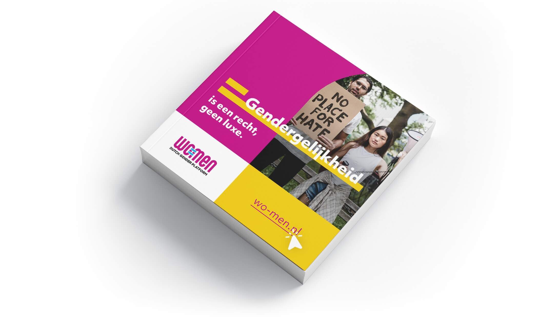
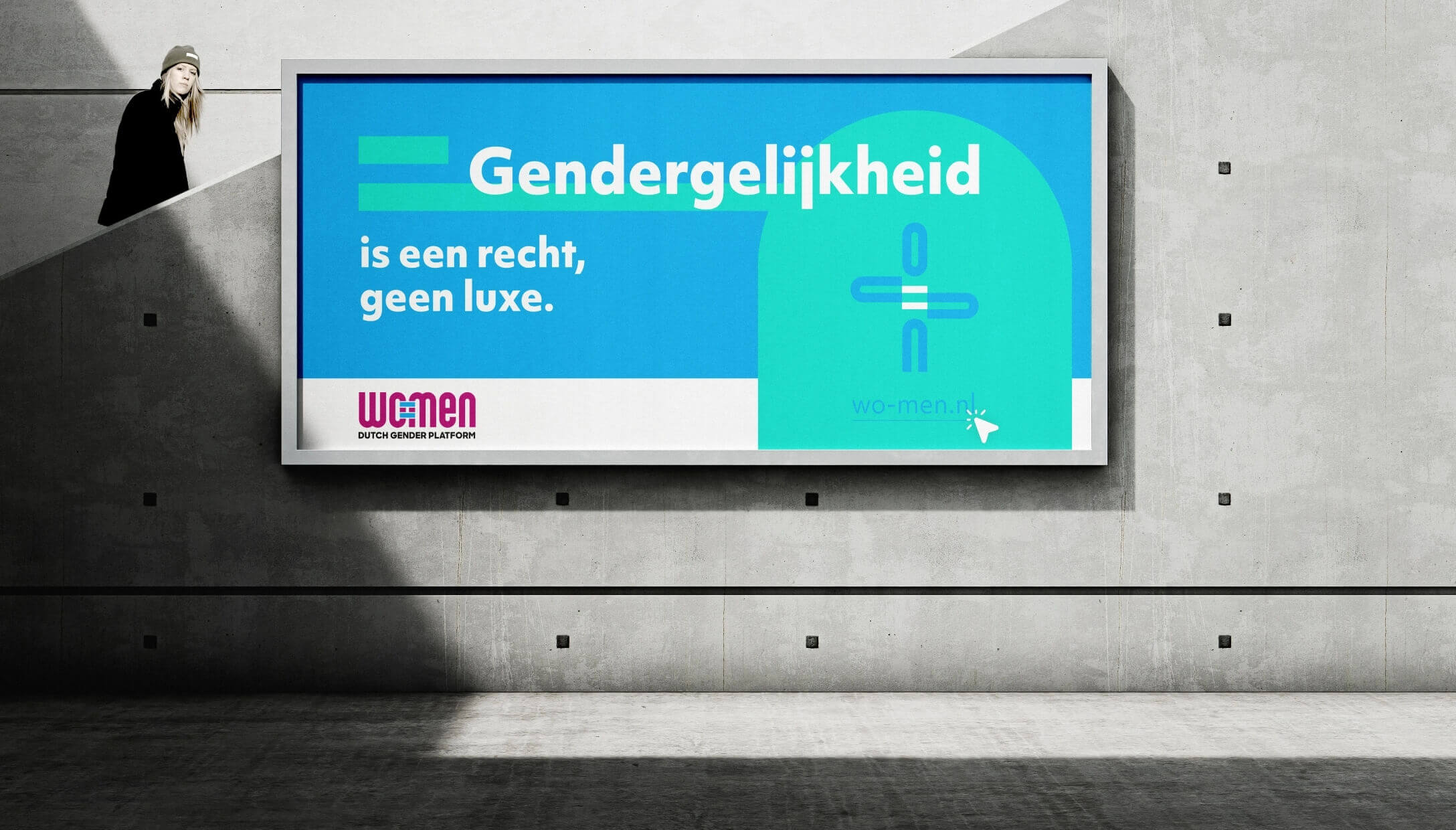
Gender equality is a right, not a luxury.
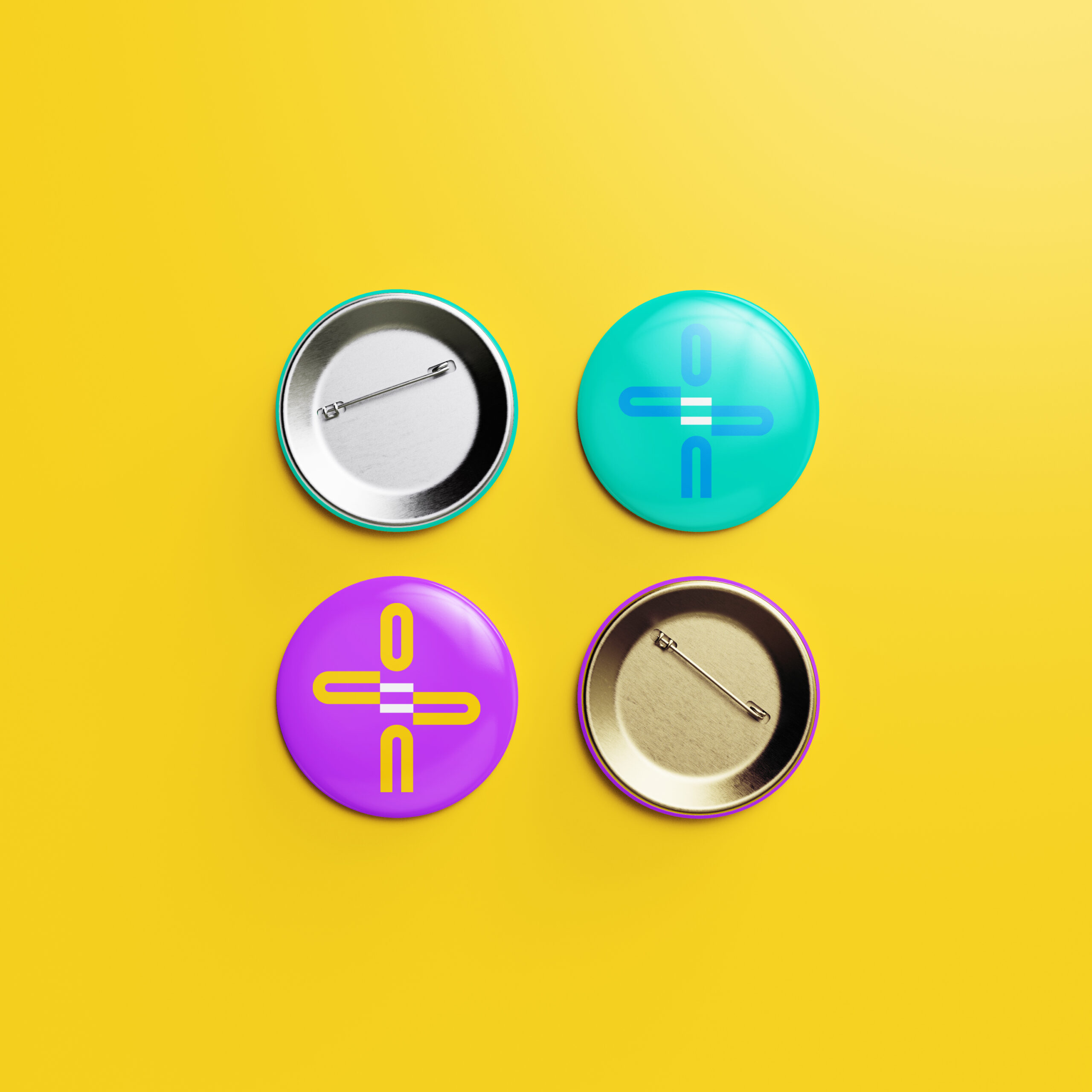
When WO=MEN approached us to revamp their visual identity while keeping their existing logo, we saw an exciting opportunity to create something truly eye-catching. We chose bright, dynamic colors that symbolize energy, diversity, and progress, reflecting the organization's commitment to challenging norms and advocating for change.
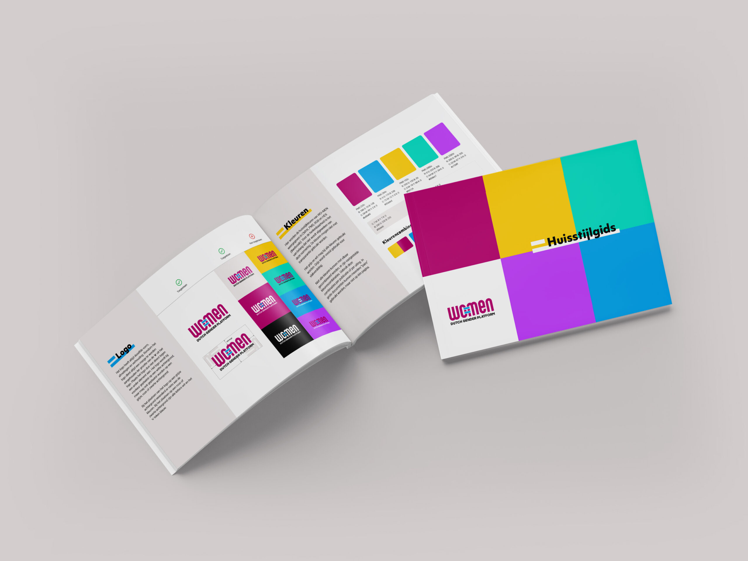
An impactful upgrade for real change-makers
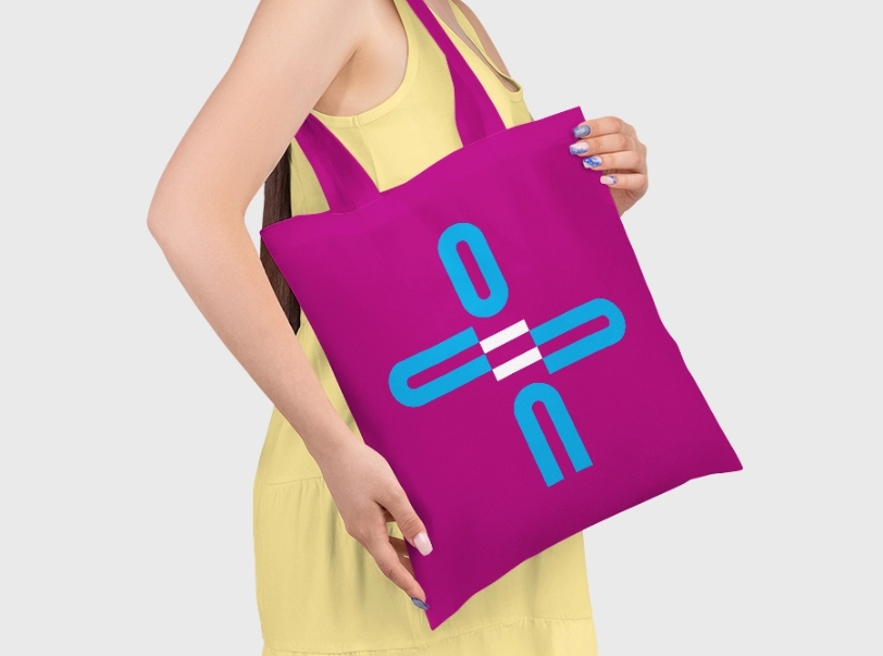
The feedback from WO=MEN and their network has been overwhelmingly positive. The new vibrant look and new mascotte has breathed fresh life into their communications, helping to engage their diverse audience and boost support for their cause.
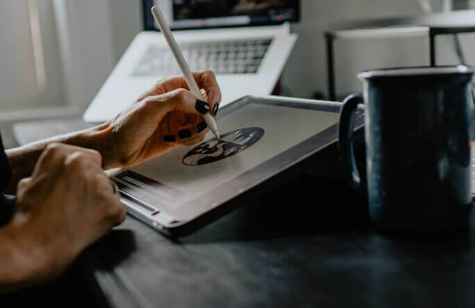
“This project was a testament to the power of bold design and effective collaboration, and I’m proud to have played a part in advancing WO=MEN's mission for a just and equal world.”
Irene, designer
